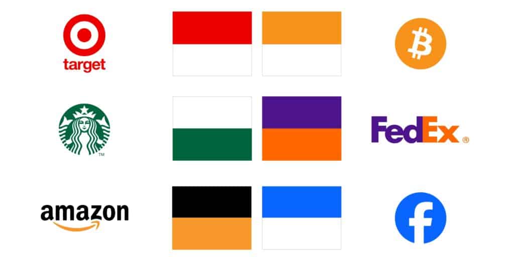
Color isn’t just decoration—it’s communication. It might be the most underappreciated form of messaging we’ve got. Every company and brand uses color, but many do so without much thought. When used effectively, color doesn’t just make things look good—it makes them clear, compelling, and, most importantly, memorable. Let’s explore the power of color in website design and brand identity:
Emotions First: What Does Your Brand Feel Like?
People don’t make decisions solely based on facts. They make them based on feelings too. So, before any product is sold or service is booked, your brand creates an emotional connection—and color is at the front of that experience.
- Blue says: “You can trust me. I’m reliable. I’ve got your back.” That’s why so many banks and tech companies lean into it. It’s the safety net of colors.
- Red? That’s the high-energy, take-action-now color. It’s the rush you feel when you see a sale or a deadline. It’s passion and urgency in one punch.
- Green takes us back to nature. Growth. Freshness. It feels like health and balance, and it’s why so many wellness brands lean into it.
If your brand were a person, what would their mood be? Now, how can you get that mood across before you even say a word? That’s what color does.
Direct the Show: Guiding Action Through Color
Ever notice how certain buttons seem to scream, “Click me”? That’s not by accident. Color is your silent salesman. The right color at the right time makes people act. Bright oranges and reds can be a magnet for attention—they cut through the noise. But if your site is calm and minimalist, maybe a soft blue or green button feels more like an invitation than a demand.
If you want your users to take action, you don’t need more words. You need the right color to give them a nudge.
Your Brand’s Uniform: Consistency Is Trust
Think of color like your brand’s uniform. People should be able to recognize you even from the tiniest flash of color. You know that feeling when you see a bright red can and immediately think of a certain soda brand? That’s not magic—that’s design. It’s consistency.
Memorable brands aren’t the ones shouting the loudest; they’re the ones showing up consistently. Whether it’s the sleek black of luxury brands or the bright, playful colors of a kids’ product, your colors should be unmistakable every time.

Function Over Form: Making Your Website Work
Design isn’t just about looking good—it’s about working better. Color plays a huge role in usability. Imagine trying to read white text on a bright yellow background (please don’t!). Colors should guide the eye, separate the important from the irrelevant, and create a seamless experience for every user—including those with visual impairments.
If you’re building a website without thinking about accessibility, you’re leaving people behind. Color can be the difference between a user saying, “I love this site,” and “I can’t read a thing.”
Cultural Nuance: Color Doesn’t Speak the Same Language Everywhere
Here’s where most brands trip up. Color doesn’t mean the same thing to everyone. In the West, white is the color of simplicity, cleanliness, and minimalism. In other cultures, it’s tied to mourning and sadness. If you’re taking your brand global, don’t make the mistake of thinking your color choices will be universally understood.
Great brands do their homework, especially when it comes to connecting with an audience from a different cultural background.
Building Loyalty One Color at a Time
Every time customers see your brand, they should get that same familiar feeling. That’s where loyalty begins—with consistency. The right colors reinforce your values, evoke positive memories, and create a sense of trust. And here’s the thing—this happens before they’ve read a single sentence or seen a single ad.
Over time, the consistency of your color scheme becomes a beacon. It says, “You can trust me. I’ll deliver.”

The Real Takeaway
Colors aren’t just there to look good. They’re there to mean something. They’re signals to your audience, telling them what to expect, how to feel, and what action to take. It’s not about being fancy or trendy—it’s about being intentional. Colors are part of your brand’s promise.
So, the next time you’re thinking about your website or branding, stop focusing on just what looks nice. Think about what works. Because the brands that win are the ones that understand how to use color to build trust, create action, and turn customers into loyal fans.
Color isn’t just decoration—it’s strategy.
Ready to discover how color can strengthen your brand? Reach out to The Grove Creative today, and let’s discuss how we can help your brand communicate clearly and effectively through color.