OKSI
A modernized brand identity for a defense and aerospace technology innovator.
OKSI (formerly OptoKnowledge Systems, Inc.) is a science and engineering company developing advanced optical, imaging, and AI-driven solutions for the defense, aerospace, and intelligence communities. With plans to formally adopt the OKSI acronym its customers already used, the company set out to mark the transition with a more modern, mission-focused identity.
The Grove team was tasked with creating a new logo and visual identity to support the name change, positioning OKSI alongside category leaders. The new mark needed to symbolize the company’s core areas of focus – defense and protection, paired with AI- and GPS-enabled tracking and targeting – while feeling distinctly more contemporary than its predecessor.
Services:
Brand Identity
Graphic Design

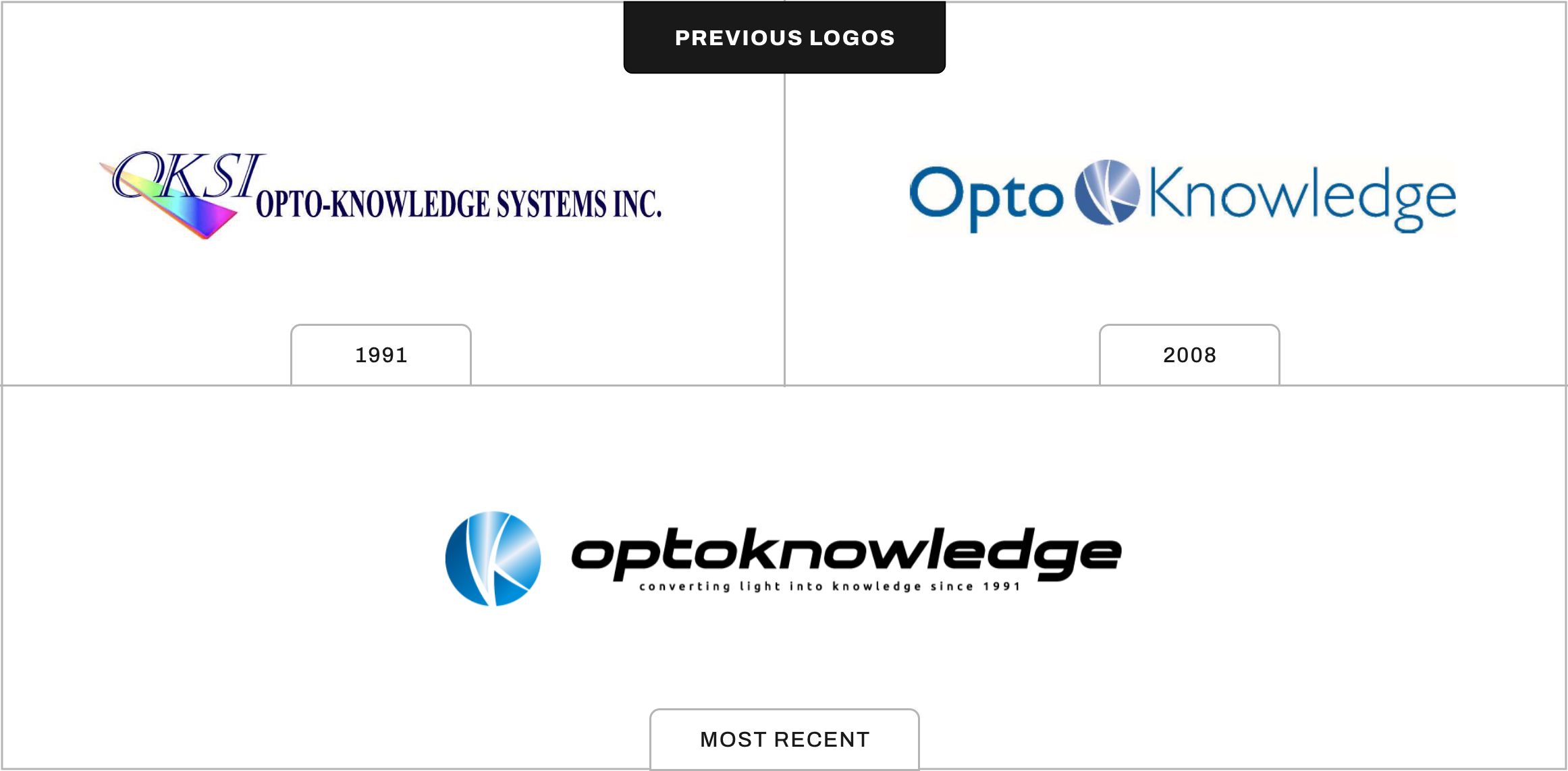
A Look at the Legacy
Before sketching a single new concept, our team took time to study the evolution of the OptoKnowledge logo – tracing how the mark had grown and adapted alongside the company over the years.
Reviewing that history gave us a clear sense of the visual equity worth carrying forward and the elements that were ready to be left behind, setting a thoughtful foundation for everything that came next.
Defining the Vision
The rebrand kicked off with a deep-dive into OKSI’s customers, capabilities, and competitive landscape. With the new name representing a moment of transition, our team focused on uncovering the visual cues that defined the modern defense and aerospace category – clean geometry, confident typography, restrained color, and marks that communicate precision at a glance.
Those benchmarks set the bar for everything that followed: the new OKSI brand needed to look like it belonged in the room with the industry’s most established names, while standing on its own as a forward-looking technology brand.
Logo Exploration
With a clear strategic foundation, our team developed several rounds of logo concepts that explored a range of visual territories tied to OKSI’s mission.
Each direction was crafted to express a different facet of the brand and to give stakeholders distinct, deliberate options to react to – not just stylistic variations on a single idea. The exploration centered on four primary themes.
The first leaned into ideas of defense, security, and trusted infrastructure. The second took inspiration from flight, with abstract birds nodding to aerospace and freedom of movement. The third explored target, pinpoint, and tracking concepts to capture precision and AI- and GPS-driven accuracy. The fourth centered on optical, sight, and vision cues, rooting the mark in OKSI’s heritage in optical and imaging technology.
Refining the Mark
Once a single direction was selected, our team moved into refinement – tightening the geometry, balancing the proportions, and stress-testing the mark across the scales and contexts OKSI would actually use it in, from technical documentation to trade show signage. Particular attention was paid to how the mark would read at small sizes and in single-color applications, which are common across defense and aerospace use cases.
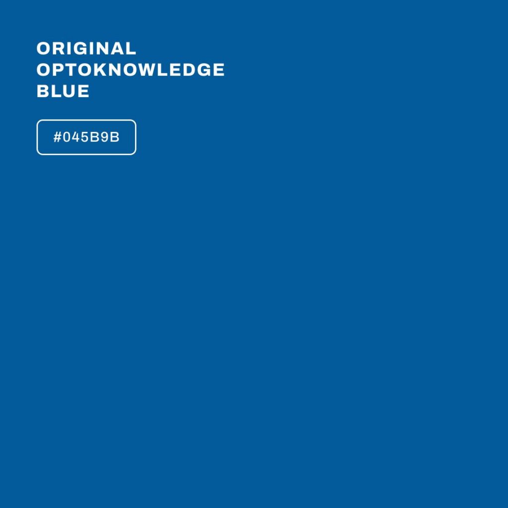
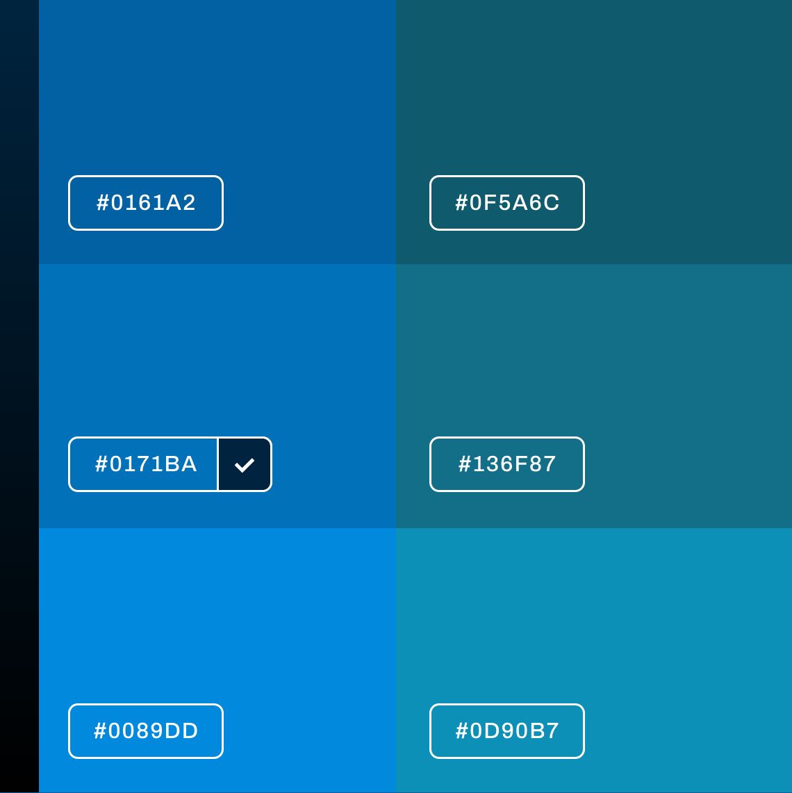
Color Exploration
With the form of the mark locked in, the team explored a range of blues to serve as a modernized evolution of the original OptoKnowledge palette. The goal was to honor the brand’s history while signaling its next chapter – moving from a dated blue toward a more confident, technology-forward hue. Each option was evaluated on both light and dark backgrounds to ensure the final palette would perform across digital interfaces, print collateral, and product environments alike.
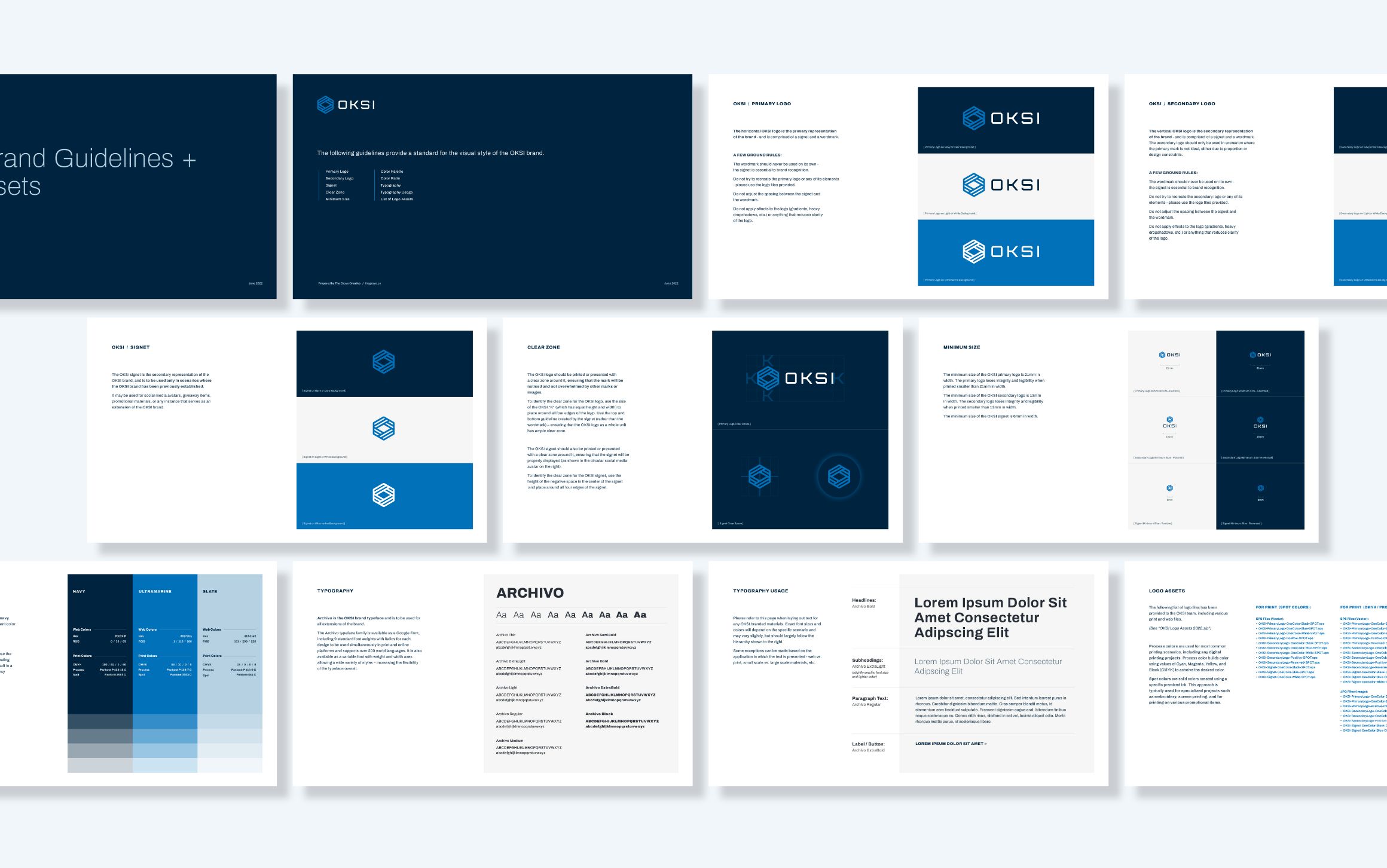
Visual Brand Guidelines
To support a smooth rollout of the new identity, our team delivered a complete set of final logo assets paired with a visual brand guidelines document. The guidelines establish a clear, consistent system for how the OKSI brand should be applied across every touchpoint – internal, customer-facing, and everything in between.
Deliverables included primary and secondary logos, signet, logo clear zone and minimum size specifications, color palette, typography recommendations. Together, these elements give OKSI’s internal teams and external partners the tools they need to apply the brand confidently and consistently as the company continues to grow.
A Brand Built for What’s Next
The new OKSI identity marks more than a name change – it’s a clear signal of where the company is headed. Through a modernized mark, a refined color story, and a structured brand system, our team helped OKSI step into its next chapter with a visual identity that stands shoulder-to-shoulder with the industry’s most established names – and reflects the precision, intelligence, and protection at the core of what they do.