
When people think about branding, they often think about logos, color palettes, and taglines. Typography rarely gets the spotlight.
And yet, typography is one of the most powerful tools in your brand system.
It shapes how your brand feels before anyone reads a single word. It reinforces your positioning, and in markets where competitors look increasingly similar, typography can quietly become your most distinctive asset.

Your Brand Has a Voice, and Typography is Its Tone
You’ve likely invested time defining your brand voice:
- Confident or conversational
- Authoritative or approachable
- Innovative or established
- Minimal or expressive
But here’s the challenge: your typography is speaking just as loudly as your copy.
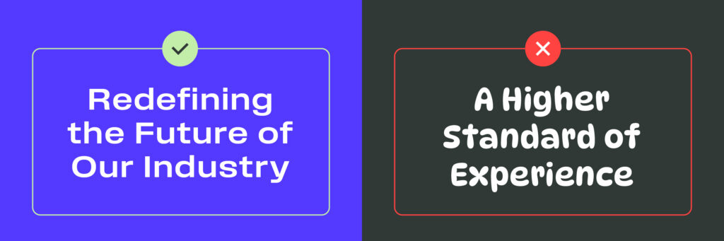
A bold, geometric sans-serif communicates something very different than a refined serif with elegant contrast. A condensed, all-caps system feels urgent and assertive. A humanist typeface feels warm and accessible.
Even if the words are identical, the experience changes dramatically.
Typography functions as your brand’s tone of voice in visual form. It influences:
- Perceived credibility
- Emotional response
- Trust
- Sophistication
- Energy level
- Approachability
Before your audience evaluates what you’re saying, they’re already interpreting how it looks.
And that interpretation shapes everything that follows.
In a Sea of Sameness, Type Becomes a Differentiator
Walk through a few B2B SaaS websites. Scroll through LinkedIn ads in your category. Review pitch decks across your competitive landscape.
You’ll likely notice a pattern:
- Similar layouts
- Similar color schemes
- Similar icon styles
- And often, the same handful of “safe” system fonts
Modern, clean, minimal — and nearly indistinguishable.
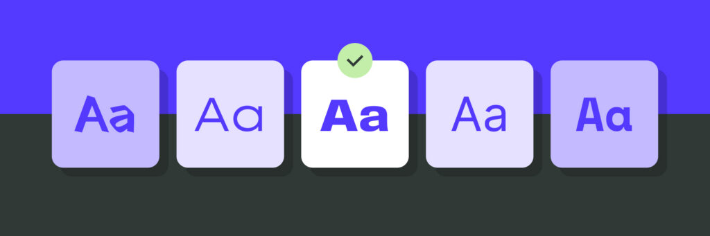
Safe typography often feels like the responsible choice. It’s legible. It’s proven. It doesn’t risk alienating anyone. But it also doesn’t help you stand out.
When competitors share visual conventions, typography becomes one of the few levers left to create meaningful distinction. A distinctive typographic system can:
- Make your brand instantly recognizable
- Create memorability across touchpoints
- Signal confidence and clarity
- Reinforce your positioning without extra messaging
Differentiation requires being intentional. A subtle but distinctive type system can do more for brand equity than another headline rewrite ever could.
Typography Builds Personality at Scale
For startups, typography often begins as a practical decision: something affordable, accessible, and easy to deploy. As the company grows, that early choice starts to show up everywhere:
- Website
- Product UI
- Investor decks
- Paid media
- Sales materials
- Event graphics
- Social content
What began as a design detail becomes infrastructure. For mid-sized companies, this is where typography either strengthens or fragments the brand.
A strong typographic system provides:
- Clear hierarchy rules
- Defined use cases (headlines, body copy, captions, data, etc.)
- Consistency across teams and markets
- A foundation for scalable creative production
When typography is systemized, teams can move faster without sacrificing consistency. When it’s loosely defined, every new asset becomes a new interpretation. Brand personality shouldn’t shift based on who created the slide deck.
The Emotional Layer Most Brands Overlook
Color tends to get credit for emotional impact. Typography is often seen as functional. But typography carries emotional weight in more subtle ways.
High-contrast serif fonts can feel editorial and elevated. Rounded forms feel friendly. Sharp, angular letterforms can feel technical or precise. Tight spacing creates intensity. Generous spacing feels premium and composed.
These choices influence how people feel about your brand before they consciously process why. For founders, this matters deeply in early-stage growth. Investors, early customers, and hires are forming impressions quickly. For marketing leaders, it matters in repositioning efforts, product launches, and market expansion.
Your typography should align with the story you’re trying to tell about who you are and who you’re becoming.
When Typography and Positioning Don’t Match
One of the most common branding disconnects isn’t messaging. It’s typography.
Consider a company positioning itself as:
- Bold and disruptive, but using a conservative, traditional typeface
- Enterprise-grade and secure, but relying on overly playful typography
- Premium and refined, but using cramped, generic system fonts
These inconsistencies create subtle friction. The audience may not be able to articulate the issue, but they feel it.
Alignment between positioning and typography builds trust. Misalignment creates doubt.
Typography as a Long-Term Asset
For growing brands, typography should be treated as an investment. This doesn’t always mean creating a custom typeface (though for some brands, that’s a powerful move). It does mean:
- Selecting typefaces intentionally, based on brand strategy
- Defining hierarchy and usage rules clearly
- Auditing inconsistencies across touchpoints
- Designing for scalability across digital and physical environments
The brands that feel cohesive, confident, and enduring rarely rely on default choices. They treat typography as part of their strategic foundation.
Ready to strengthen your brand from the inside out?
If your typography isn’t fully aligned with your positioning or you’re unsure whether it’s working as hard as it could be, our team at The Grove Creative can help. Let’s build a brand system that speaks with clarity, confidence, and distinction.
Connect with us to start the conversation.